Small Dashboards, Big Trust
- Worajedt Sitthidumrong
- Healthcare it
- June 24, 2026
Table of Contents
A dashboard becomes useful when a team can argue with it. If people only admire the chart, it is decoration. If they can question the number, trace it back, and decide what to do next, it becomes part of operations.
In healthcare software, dashboards often begin with ambition. Leaders want a complete view of the business, clinical operations, patient flow, revenue, quality, staffing, and risk. The impulse is understandable. The organization is complex, and complexity asks for visibility.
But the first dashboard that actually changes behavior is usually smaller.
One room, one question
The best dashboard projects begin with a room and a question. The room might be an operations meeting, a product review, a hospital command center, or a weekly management call. The question might be: “Where are cases waiting too long?” or “Which integration failures need attention before they affect users?”
That framing matters because it gives the dashboard a job. Without a job, every chart competes for attention. With a job, the team can remove anything that does not help the decision.
Define the number in plain language
Trust breaks when two people use the same metric name for different calculations. “Active case” can mean opened today, currently assigned, not yet completed, billable, clinically active, or visible in a specific workflow. The dashboard may be technically correct and still socially useless.
Every important metric needs a plain-language definition near the chart or in a linked note. It should say what is included, what is excluded, how often it refreshes, and who owns the definition. This sounds administrative, but it is product design. A dashboard without definitions asks users to bring their own truth.
Show freshness and gaps
Healthcare data often arrives through many systems. Some feeds are real time. Some are nightly. Some are delayed by workflow. A trusted dashboard should say when the data was last updated and whether any source is missing.
This is not a technical footnote. It changes the conversation. A manager looking at stale data should know they are looking at stale data before making a decision. A support team investigating a spike should know whether the spike is real or caused by a late import.
Make the next action visible
The most useful dashboards point toward action. A queue view can link to the cases that need review. A failure chart can link to logs. A trend can show the few dimensions that explain the movement. A quality metric can show the owner of the next follow-up.
The dashboard does not need to solve every problem. It needs to reduce the distance between noticing and acting.
Start smaller than your ambition
A small dashboard can become the foundation for a larger data platform because it creates shared language. Once the team trusts a few numbers, it becomes easier to add more. Once people see that definitions matter, they ask better questions. Once the data gaps are visible, infrastructure investment becomes easier to justify.
Big platforms are built from small moments of trust. The dashboard should be one of those moments.
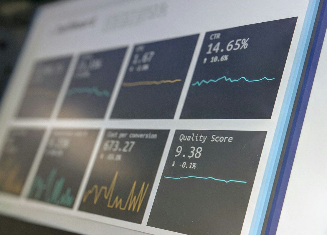
Cover image: Photo by Stephen Dawson on Unsplash.